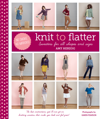
All of the covers we design at STC Craft have their own particular challenges. Which image is the best representation of the book? Will one beautiful image suffice, or do we need more? Should we include a burst calling out a special feature, or find a way to incorporate it into the subtitle? The answers to these questions can sometimes take months to answer, and the cover for Knit to Flatter was no exception.
Before we arrived at the cheerful pink polka-dot cover shown above, designer Meg Mateo Ilasco patiently tried many options, including single images, creative detail shots, and small groupings, but nothing was quite right. Then, one night when I was at the office far too late, inspiration hit: we need to show all of the models on the cover! That is, after all, the spirit of the book: to show nine women with totally unique styles and shapes wearing hand-knit sweaters that make them look good and feel great. To put them all together on the cover was proof that there were no smoke and mirrors at play—this system of choosing sweater patterns and knitting to fit your shape works!

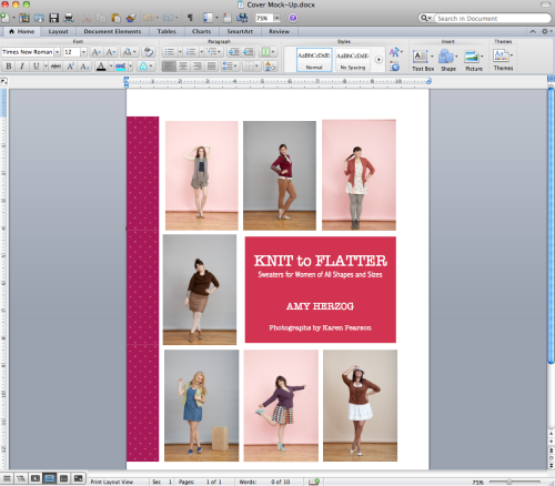
Unfortunately (or fortunately), editors at STC Craft headquarters don't have access to design software, so to express my vision to Meg, I dragged photos into Microsoft Word (I know, it doesn't get more low-tech than that) and created a grid. Melanie provided the inspiration for the polka dots—don't polka dots make everything fun? And that's really what we were going for. The book is a celebration of not just our bodies, but of our sweaters and our pride in what we make.

What Meg sent back was definitely getting there! But the raspberry palette just wasn't feeling right. So Meg refined her idea and presented us with four options, all of which we loved: a black option, a black-and-pink option, a white option, and the white-and-pink option we ultimately chose (see top of post). I absolutely love our finished cover, though I must admit there are a few options here that I am still fond of. What do you think, readers? Would you have picked a different cover?


