Choosing a cover from all of the lovely photographs taken for each book is often one of the hardest parts of the bookmaking process, and creating something to define Lynne Barr's third groundbreaking book, The Shape of Knitting, was no exception. With Thayer Allyson Gowdy's beautiful photography as a starting point, designer Mary Jane Callister got to work.
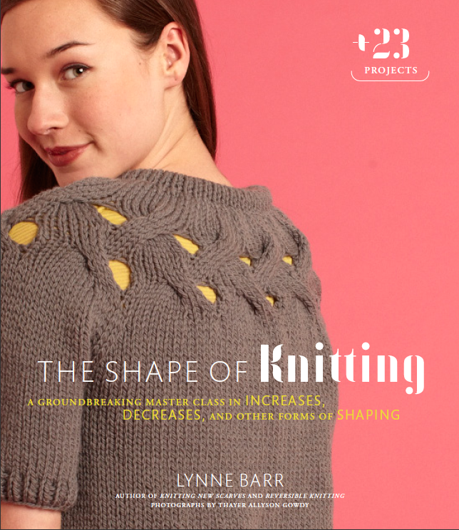
Featuring the My Tie Cardigan, the first cover she created was certainly pretty. But, although we were excited by the bright, eye-catching pop of pink, we didn't like that we couldn't see the front of the sweater.
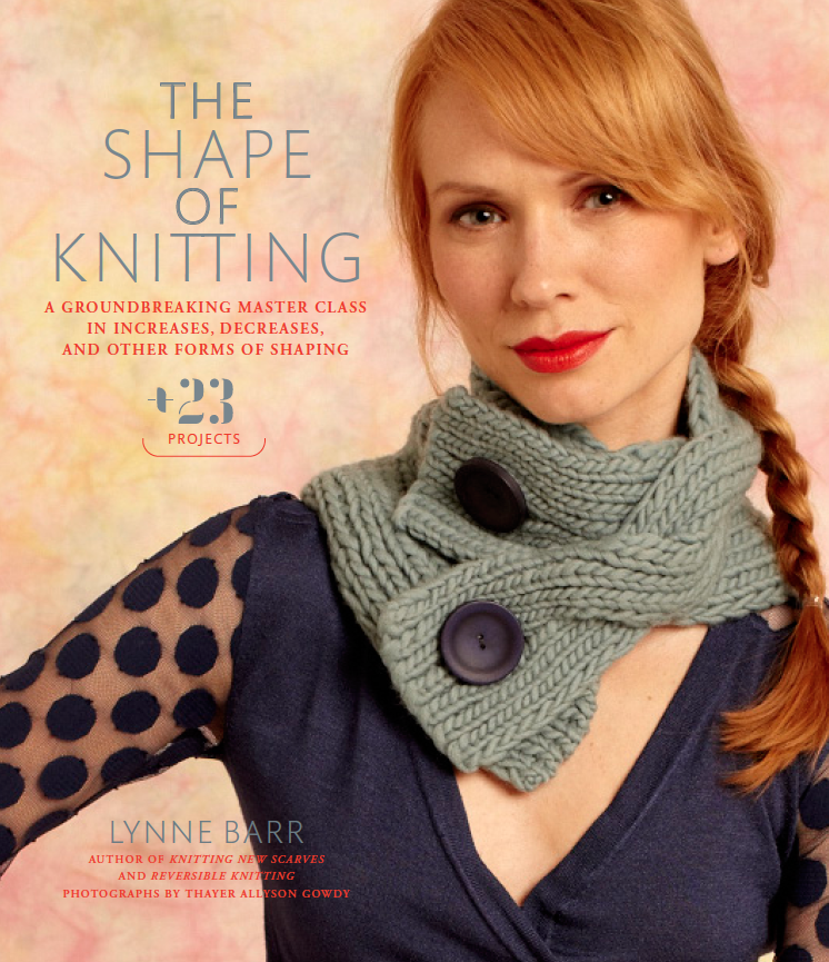
The Big Button Cowl project is a definite crowd-pleaser, but we weren't as immediately drawn to the colors and overall look of this cover as much as the others.
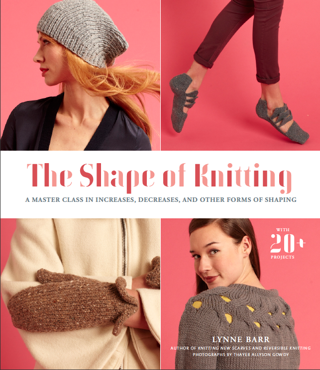
Grid covers are a great option for when we can't pin down a single image that works. But grids are almost always less visually striking, so we prefer to go with a single image when we can (even when they're this pretty).
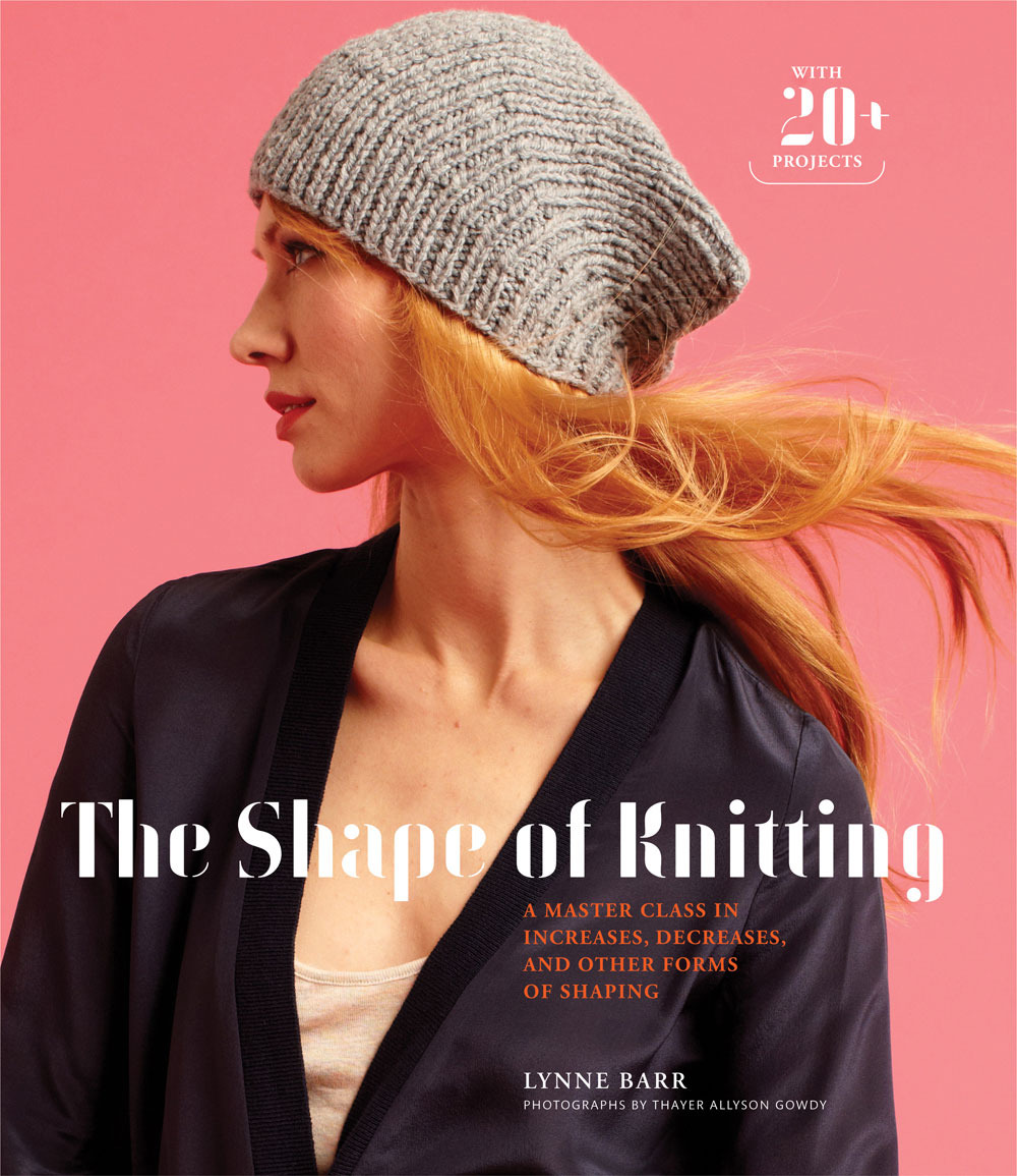
This cover was finally getting there. From the start, Melanie liked this image the most because it was so dramatic and the delicate shaping on the Tilda Hat is very prominent (this is The Shape of Knitting, after all!). But we wanted to make sure the text was clear, and the grey box around the title felt distracting.
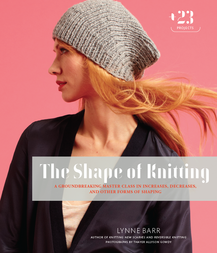
And voila! Although it took a long time to put the pieces of this puzzle in place, we felt the final cover ultimately conveyed the the spirit of the book at a glance: creating knitwear that is glamourous, timeless, iconic, and memorable.
Which cover would you have chosen? Check out these and other photos from the book here.
